Responsive Design for Mobile Multimedia


Writing Stories Your Learners Will Savor
April 15, 2013
Small Businesses: Get Ready for the Affordable Care Act
May 20, 2013(By Jennifer McNeil and Steven Day)
Remember when work looked like this?

Chained to a computer, we were stuck in the office, with limited options—PC or Mac, Internet Explorer or Firefox, email or telephone.
Today, work looks more like this:

We are on the move, all the time. We bring our own devices (BYOD) and use snippets of time to catch up on email or Facebook, or the latest breaking news. Device types are blending and blurring, as we see separate devices replaced by mobile phone and tablet apps for GPS and readers and built-in cameras. Many people don’t even own a standalone computer. In early 2012, Apple reported that for the first time ever, people accessed the web more frequently with their mobile operating system (iOS) than with their desktop Mac OS. Developing countries all over the world are reporting the same phenomenon: mobile browsing is taking over computer browsing.
The Challenge of Mobile Multimedia
Users want to use any device, any place, any time, and have the same high-quality experience they have come to expect from a high-end laptop or desktop computer. That is the challenge of Mobile Multimedia—media that are on the move with us on our device of choice. And as the types and numbers of devices multiply, this challenge has become increasingly difficult.
The Solution: Responsive Design
C2’s response to this challenge is to develop content using the Responsive Design methodology. “Responsive Web Design,” a term coined by Ethan Marcotte in a 2010 article, is really the next evolution of layout.
Early web pages used tables for layout; then CSS design moved to pixel layouts, and later to fluid grids. Now, with the addition of CSS media queries, we have the adaptive layouts of Responsive Design.
The heart of Responsive Design is that content should adapt to the size and orientation of display devices, whether a small cell phone screen or an extra-wide monitor, to give users the best possible experience. Whereas early solutions sent users to a different site for mobile devices, Responsive Design uses a single instance for display on all devices. Instead of simply shrinking the content down to match the browser or phone size, the web page responds based on browser or phone settings and reformats itself to present the best experience, based on the user’s needs. It might be that your screen size makes columns unusable, or certain bits of flair that you might see on a desktop computer don’t translate to a 2″ × 4″ screen. Whether you’re using an iPad or an Android smart phone, the content adapts itself to your device, like fluid in a container.
How It Works
On the technical side, Responsive Design is accomplished via CSS3 media queries, JavaScript, and jQuery. This allows different formatting styles to be applied to the content, based upon the returned media features, which include the height and width of the device in use as well as orientation.
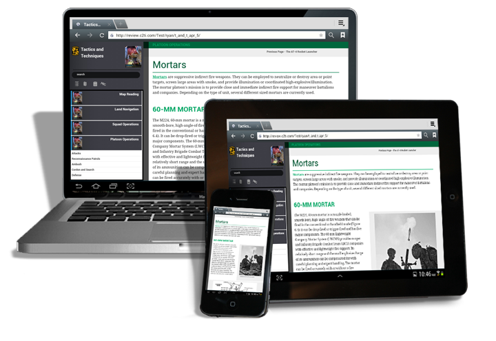
Left-hand menu auto hides on mobile phone as part of Responsive Design.
Column widths expand and contract to fit the device size and orientation.
A Shift in Thought Process
There are a few challenges to overcome, however. Since mobile technology still has limitations, you need to rethink your content from the ground up. The term “mobile first” is often used to describe the principle that ensures that all of your users will get the best possible experience. Instead of gracefully degrading your larger content to fit into a smaller box, you start by designing for the smallest device and then progressively enhance the content to the capabilities of larger devices.
In summary, Responsive Design is not a technology or a new tool, but a methodology that allows Web pages to reformat automatically for optimal display on any device. As mobile technology advances, users expect more. As design professionals, we should not limit ourselves to the paradigm of the printed page. Our real estate is not a fixed size, and our thoughts cannot be either.
For More Information:
Here are some good resources for learning more about Responsive Design:
http://blog.teamtreehouse.com/beginners-guide-to-responsive-web-design
http://msdn.microsoft.com/en-us/magazine/hh653584.aspx
http://johnpolacek.github.io/scrolldeck.js/decks/responsive/
http://mashable.com/2012/12/11/responsive-web-design/
http://www.abookapart.com/products/responsive-web-design
http://en.wikipedia.org/wiki/Responsive_web_design
Steven Day recently presented on this topic, with Matthew Evert and Ryan Schwab at the Training Officer’s Consortium Annual Institute.